




RFS is a unit resizing engine which was initially developed to resize font sizes (hence its abbreviation for Responsive Font Sizes). Nowadays RFS is capable of rescaling basically every value for any css property with units, like margin, padding, border-radius or even box-shadow.
The mechanism automatically calculates the appropriate values based on the dimensions of the browser viewport. It's available in one of your favourite preprocessors or postprocessor: Sass, Less, Stylus or PostCSS.



- Card example (Sass)
- Card example (Sass, with custom properties)
- Card example (PostCSS)
- Card example (PostCSS, with custom properties)
- Simple font rescaling Codepen Demo
- RFS in Bootstrap demo
- No need to rescale paddings or margins anymore.
- Text won't be chopped off in smaller viewports when RFS is applied to font sizes.
- RFS will prevent the font size from rescaling too small, so readability can be assured.
- The font sizes of all text elements will always remain in relation with each other.
The following example shows the effect of RFS on font sizes:
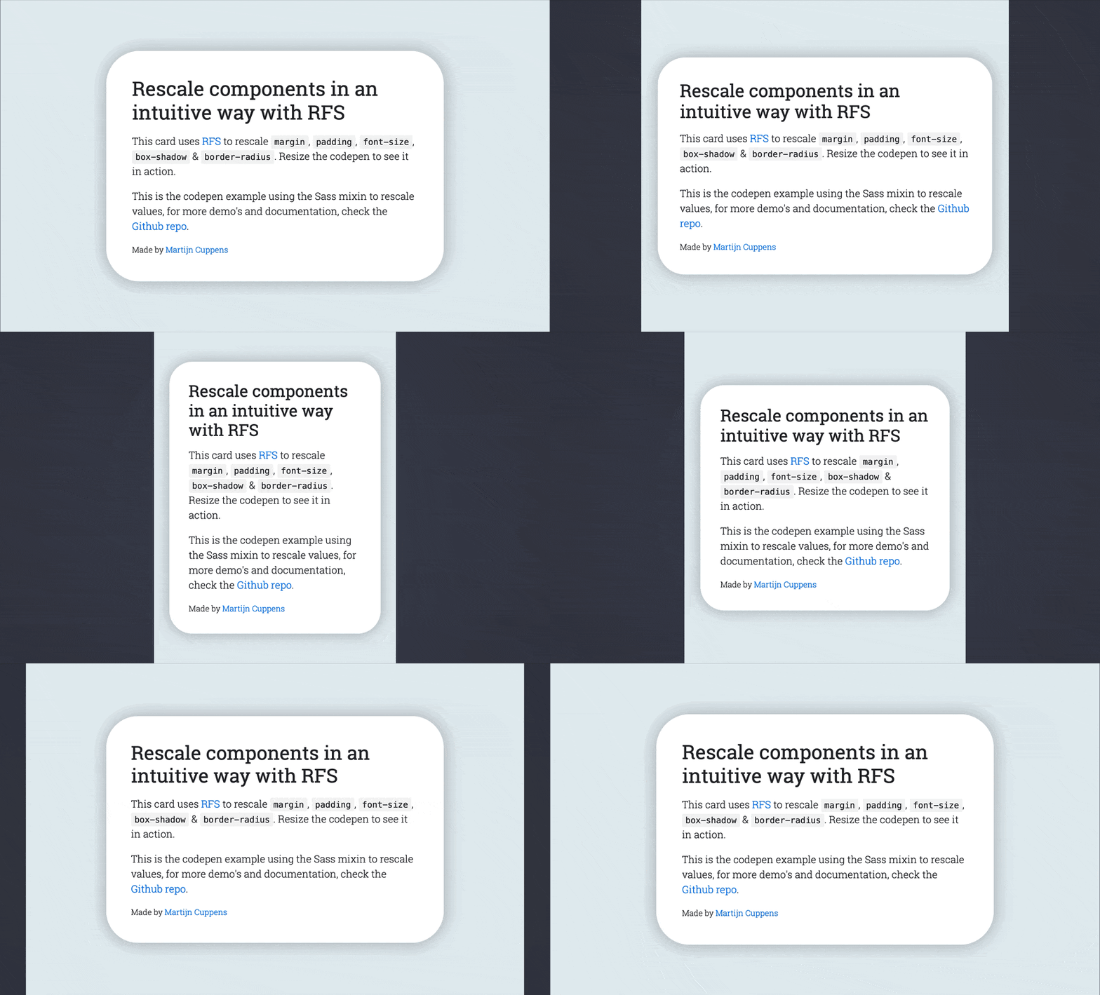
RFS can be installed using a package manager (recommended):
- npm:
npm install rfs - yarn:
yarn add rfs - bower (deprecated):
bower install rfs --save
Copy/paste (not recommended):
The source files can also be downloaded manually and used in a project. This method is not recommended because you lose the ability to easily and quickly manage and update RFS as a dependency.
project/
├── node_modules/
│   └── rfs
│        └── ...
└── scss/
    └── main.scss
// scss/main.scss

@import "../node_modules/rfs/scss";

.title {
  @include font-size(4rem);

  // The font-size mixin is a shorthand which calls
  // @include rfs(4rem, font-size);

  // Other shorthand mixins that are available are:
  // @include padding(4rem);
  // @include padding-top(4rem);
  // @include padding-right(4rem);
  // @include padding-bottom(4rem);
  // @include padding-left(4rem);
  // @include margin(4rem);
  // @include margin-top(4rem);
  // @include margin-right(4rem);
  // @include margin-bottom(4rem);
  // @include margin-left(4rem);

  // For properties which do not have a shorthand, the property can be passed:
  // @include rfs(4rem, border-radius);

  // Whenever a value contains a comma, it should be escaped with `#{}`:
  // @include rfs(0 0 4rem red #{","} 0 0 5rem blue, box-shadow);

  // Custom properties (css variables):
  // @include rfs(4rem, --border-radius);
}
If you're using Webpack, you can simplify the @import using the ~ prefix:
@import "~rfs/scss";.title {
font-size: calc(1.525rem + 3.3vw);
}
@media (min-width: 1200px) {
.title {
font-size: 4rem;
}
}.label {
@include font-size(2.5rem !important);
}.label {
font-size: calc(1.375rem + 1.5vw) !important;
}
@media (min-width: 1200px) {
.label {
font-size: 2.5rem !important;
}
}project/
├── node_modules/
│ └── rfs
│ └── ...
└── sass/
└── main.sass
// sass/main.sass

@import "../node_modules/rfs/sass"

.title
  +font-size(4rem)

  // The font-size mixin is a shorthand which calls
  // +rfs(4rem, font-size)

  // Other shorthand mixins that are available are:
  // +padding(4rem)
  // +padding-top(4rem)
  // +padding-right(4rem)
  // +padding-bottom(4rem)
  // +padding-left(4rem)
  // +margin(4rem)
  // +margin-top(4rem)
  // +margin-right(4rem)
  // +margin-bottom(4rem)
  // +margin-left(4rem)

  // For properties which do not have a shorthand, the property can be passed:
  // +rfs(4rem, border-radius)

  // Whenever a value contains a comma, it should be escaped with `#{}`:
  // +rfs(0 0 4rem red #{","} 0 0 5rem blue, box-shadow)

  // Custom properties (css variables):
  // +rfs(4rem, --border-radius)
If you're using Webpack, you can simplify the @import using the ~ prefix:
@import "~rfs/scss".title {
font-size: calc(1.525rem + 3.3vw);
}
@media (min-width: 1200px) {
.title {
font-size: 4rem;
}
}.label
+font-size(2.5rem !important).label {
font-size: calc(1.375rem + 1.5vw) !important;
}
@media (min-width: 1200px) {
.label {
font-size: 2.5rem !important;
}
}project/
├── postcss/
│ └── main.css
└── node_modules/
└── rfs
└── ...
Have a look at the examples folder to find examples on how your PostCSS setup can be configured.
// postcss/main.css

.title {
  font-size: rfs(4rem);

  // Or use it with any other property, for example
  // padding: rfs(4rem);

  // It's also possible to pass multiple values
  // padding: rfs(3rem 4rem);

  // or even
  // box-shadow: rfs(0 3px 4rem red);

  // or even comma seperated values
  // box-shadow: rfs(0 3px 4rem red, 3px 0 4rem blue);

  // To combine it with !important, use
  // box-shadow: rfs(0 3px 4rem red) !important;

  // Custom properties (css variables):
  // --border-radius: rfs(4rem);
}.title {
font-size: calc(1.525rem + 3.3vw);
}
@media (min-width: 1200px) {
.title {
font-size: 4rem;
}
}project/
├── less/
│ └── main.less
└── node_modules/
└── rfs
└── ...
// less/main.less

@import "../node_modules/rfs/less";

.title {
  .font-size(4rem);

  // The font-size mixin is a shorthand which calls
  // .rfs(4rem, font-size);

  // Other shorthand mixins that are available are:
  // .padding(4rem);
  // .padding-top(4rem);
  // .padding-right(4rem);
  // 'padding-bottom(4rem);
  // .padding-left(4rem);
  // .margin(4rem);
  // .margin-top(4rem);
  // .margin-right(4rem);
  // .margin-bottom(4rem);
  // .margin-left(4rem);

  // For properties which do not have a shorthand, the property can be passed as:
  // .rfs(4rem, border-radius);

  // Whenever a value contains a comma, it should be escaped with a tilde(~):
  // .rfs(0 0 4rem red ~"," 0 0 5rem blue, box-shadow)

  // Custom properties (css variables):
  // .rfs(4rem, --border-radius)
}
If you're using Webpack, you can simplify the @import using the ~ prefix:
@import "~rfs/less".title {
font-size: calc(1.525rem + 3.3vw);
}
@media (min-width: 1200px) {
.title {
font-size: 4rem;
}
}Less still has a bug for native !important support, and !important can not be accepted as a parameter, so you 'll need to pass important as a flag:
.label {
  .font-size(2.5rem important);
}.label {
font-size: calc(1.375rem + 1.5vw) !important;
}
@media (min-width: 1200px) {
.label {
font-size: 2.5rem !important;
}
}project/
├── node_modules/
│ └── rfs
│ └── ...
└── stylus/
└── main.styl
// stylus/main.styl

@import "../node_modules/rfs/stylus";

.title
  rfs-font-size(64px)

  // The font-size mixin is a shorthand which calls
  // rfs(4rem, font-size)

  // Other shorthand mixins that are available are:
  // rfs-padding(4rem)
  // rfs-padding-top(4rem)
  // rfs-padding-right(4rem)
  // rfs-padding-bottom(4rem)
  // rfs-padding-left(4rem)
  // rfs-margin(4rem)
  // rfs-margin-top(4rem)
  // rfs-margin-right(4rem)
  // rfs-margin-bottom(4rem)
  // rfs-margin-left(4rem)

  // For properties which do not have a shorthand, the property can be passed as:
  // rfs(4rem, border-radius)

  // Whenever a value contains a comma, it should be escaped with a backslash:
  // rfs(0 0 4rem red \, 0 0 5rem blue, box-shadow)

  // Custom properties (css variables):
  // rfs(4rem, --border-radius)
Note the font-size mixin can not be used to set the font size. That is because a font-size() mixin would override the font-size property. See 129#issuecomment-477926416 for more info.
If you're using Webpack, you can simplify the @import using the ~ prefix:
@import "~rfs/stylus".title {
font-size: calc(1.525rem + 3.3vw);
}
@media (min-width: 1200px) {
.title {
font-size: 4rem;
}
}